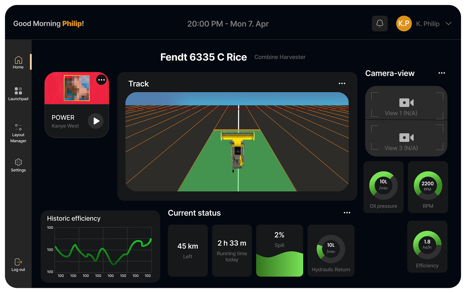
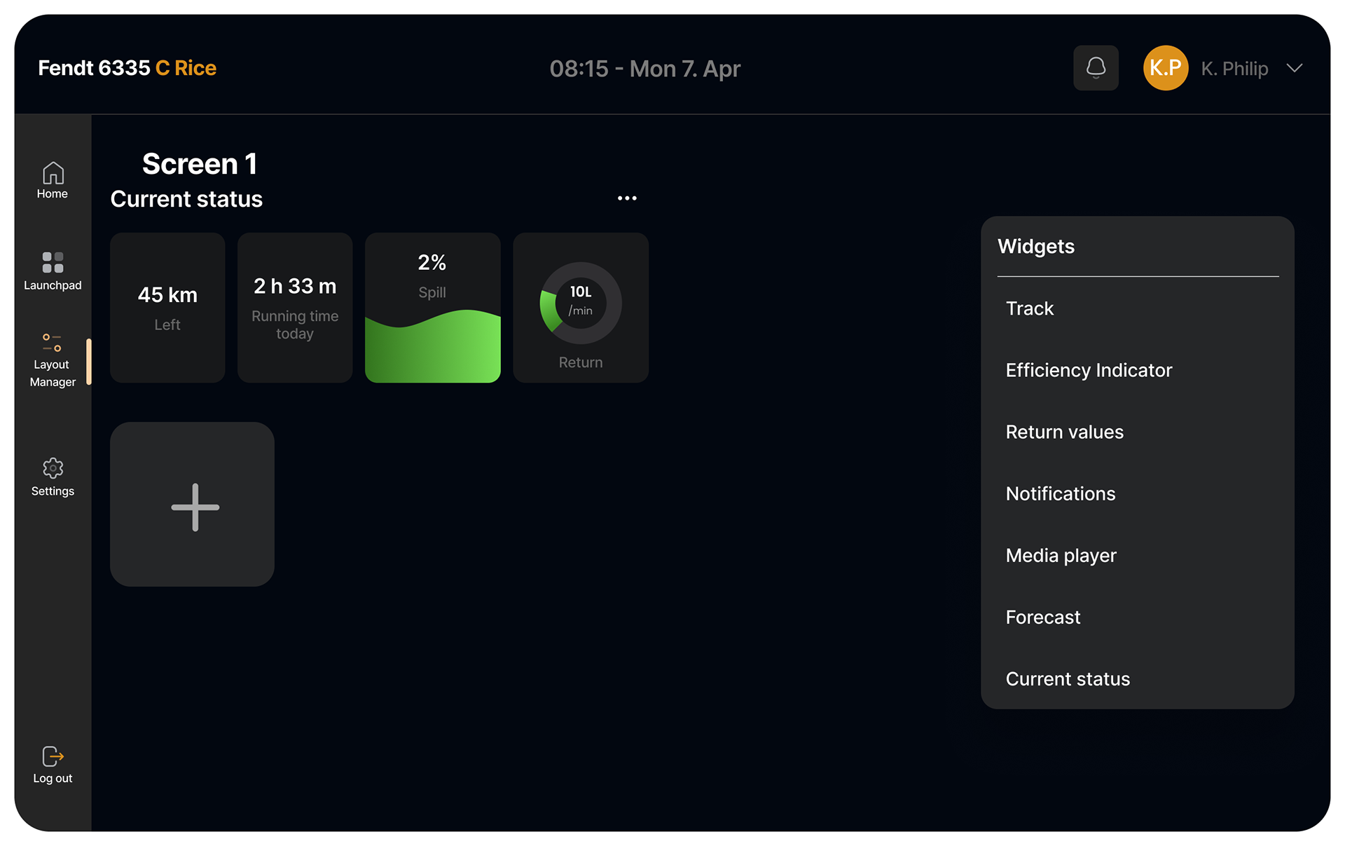
Dashboard example
INTRODUCTION & BACKGROUND
This project was carried out as part of the TPD4167 Information Visualization course and developed in collaboration with CrossControl, a technology company specializing in advanced digital interfaces for industrial vehicles. The aim was to design a modern, user-centered Human-Machine Interface (HMI) for agricultural machinery, with a specific focus on combine harvesters. With the rapid digitization of vehicle cabins and the growing complexity of onboard systems, there is a pressing need to rethink how operators interact with these technologies. Combine harvesters, which demand constant oversight and adjustment of multiple systems in dynamic, high-stress environments, provided an ideal case study. The project was grounded in the principles of Human-Centered Design (HCD) and visual cognition theory, ensuring that our approach remained focused on real user needs and practical usability throughout.
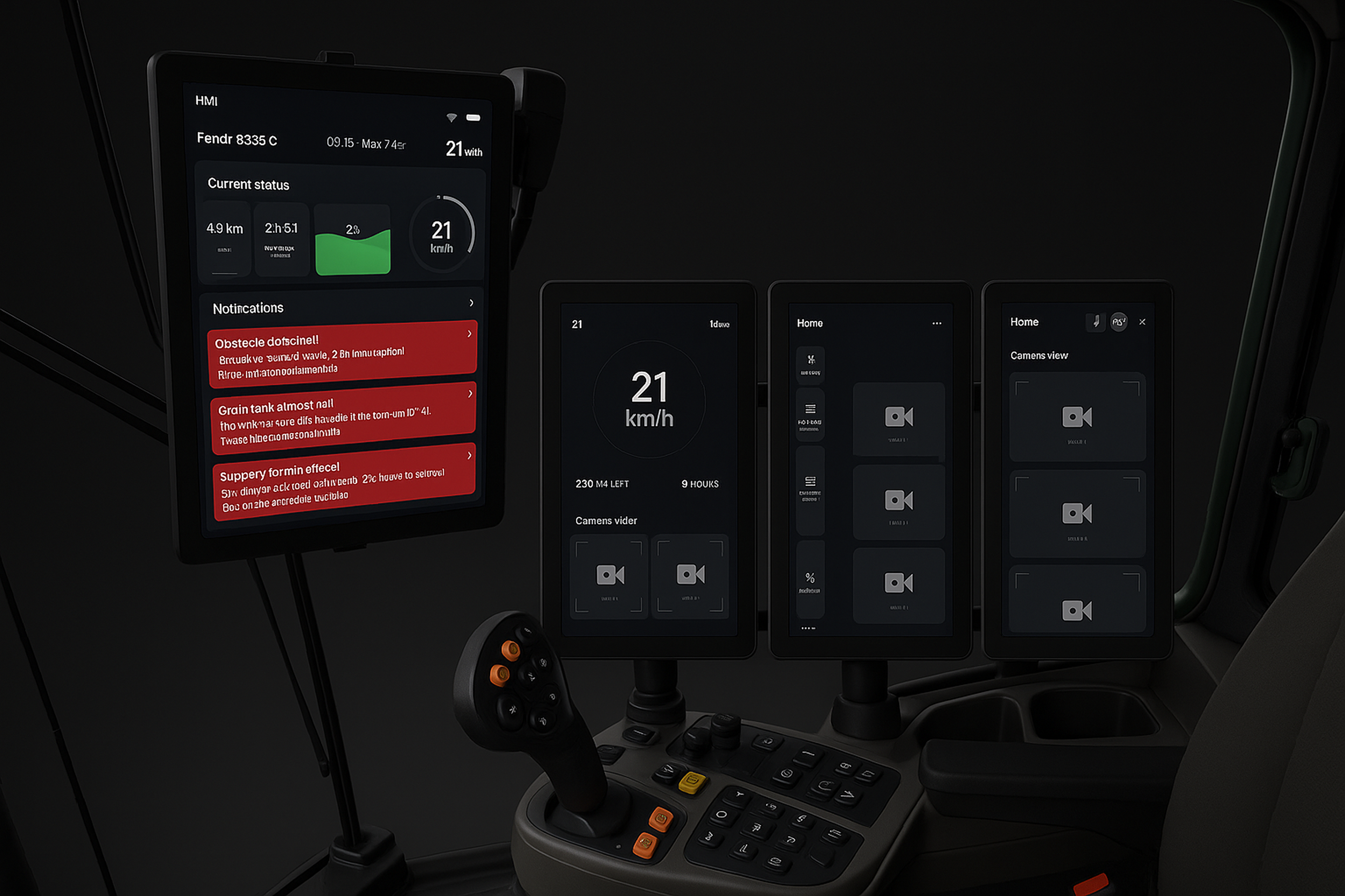
AI render of how the screens would look in practice. (Open AI, SORA)
THE PROBLEM
As industrial vehicles become more digitally advanced, the interface landscape inside their cabins is becoming increasingly fragmented. Rather than integrating seamlessly, many new features are added through additional hardware and own screens, contributing to operator fatigue, reduced situational awareness, and increased cognitive load. CrossControl identified this fragmentation as a critical challenge, particularly in agriculture where machinery like combine harvesters must manage complex, real-time operations across multiple systems. Moreover, modern operators have rising expectations for intuitive, car-like interfaces that offer comfort, clarity, and customization. The problem, then, is not merely technical, it’s deeply human:
"How can we design an HMI that aligns with CrossControl’s visual identity, supports task efficiency, and enhances the user experience in environments marked by vibration, dust, sunlight, and long working hours?"
THE DESIGN PROCESS
Our design process followed an iterative and user-centered methodology, rooted in industry best practices and academic frameworks. We began by understanding the operational context through discussions with CrossControl and supplementary research including video analysis, user manuals, and agricultural forums. With this foundation, we conducted a user and task analysis, gathering qualitative insights from professionals like participant 1 (argiculture teacher) and participant 2 (agriculture machinery professional) to map out workflows and pain points. Ideation began with sketching and low-fidelity wireframes, evolving into interactive Figma prototypes that allowed us to test layout concepts, module organization, and visual hierarchies. Prototyping was central to the project and guided by consistent user feedback. Visual clarity, touch usability, and cognitive simplicity were prioritized, informed by theories of visual cognition and interaction design. With each iteration, feedback from experts and CrossControl’s team helped refine the interface, ensuring that the final design was both usable and aligned with technical constraints and user expectations.

Dashboard example
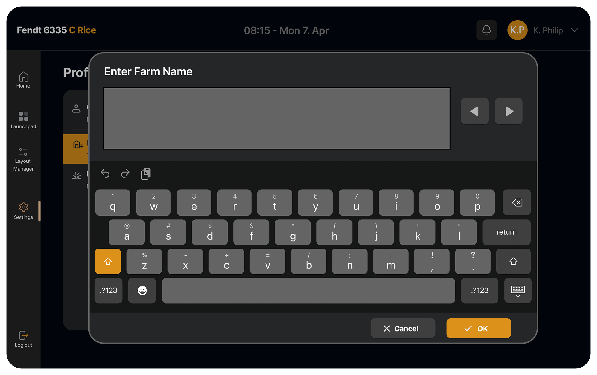
Use of a digital keyboard
Preset builder
Preset builder ex.

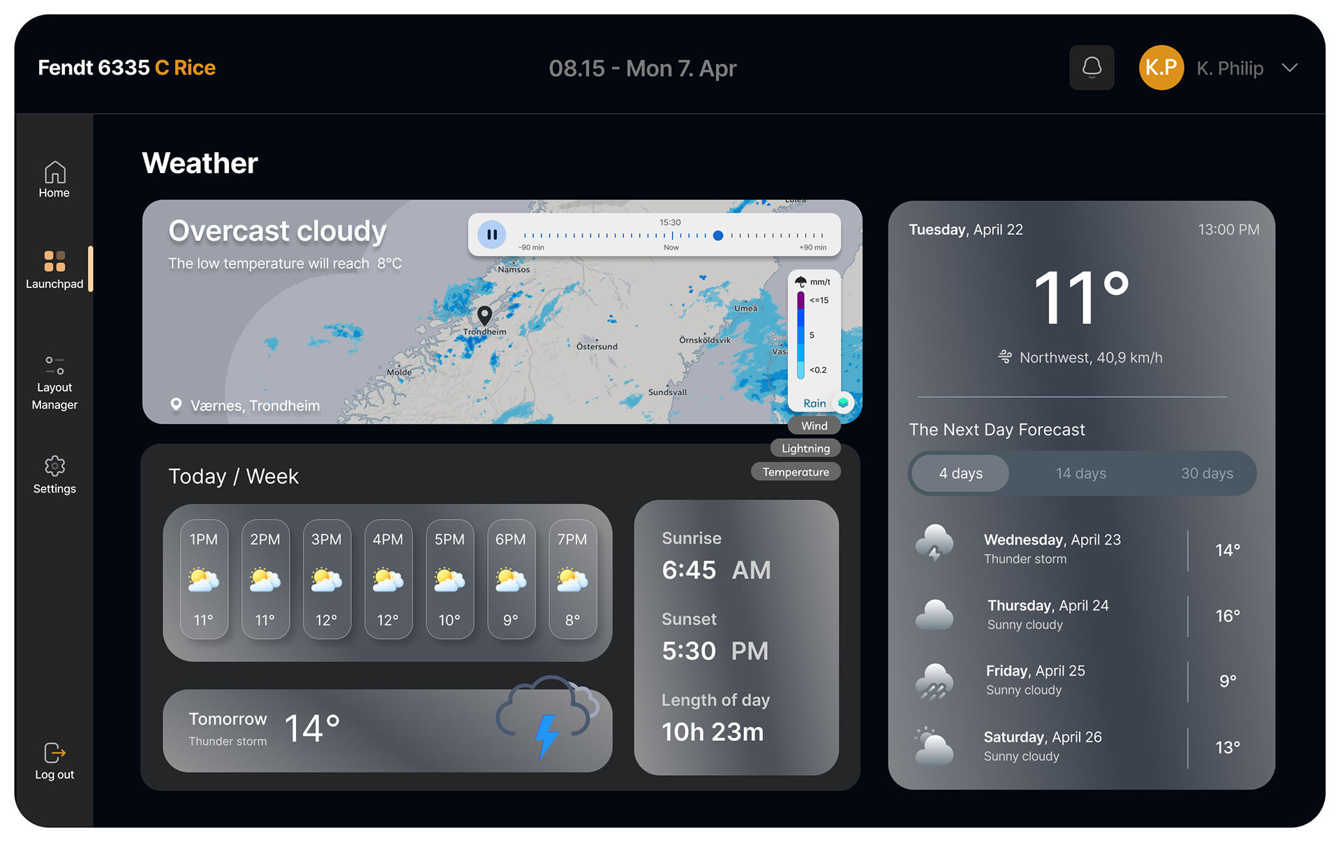
Live weather forecast
Alternate view for vertical screens.
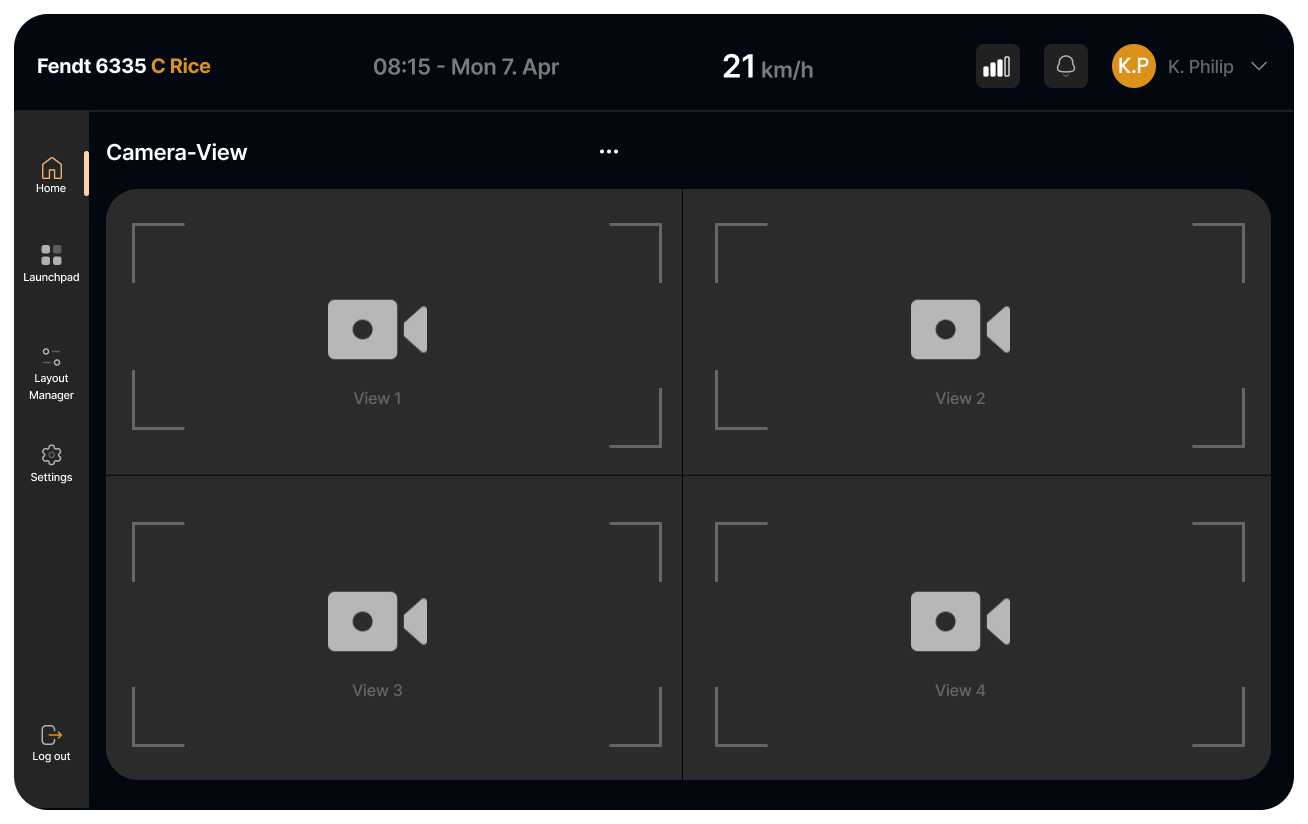
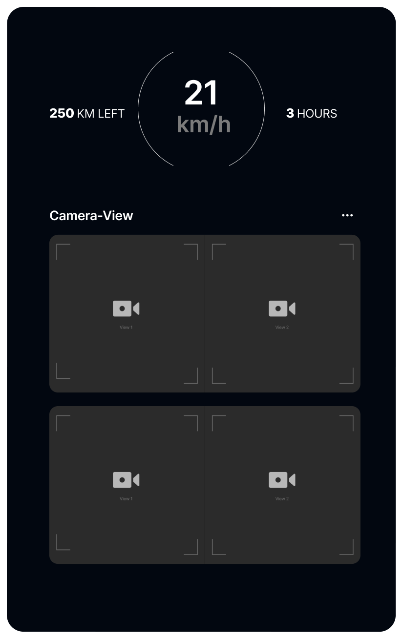
Camera view mode
THE RESULT
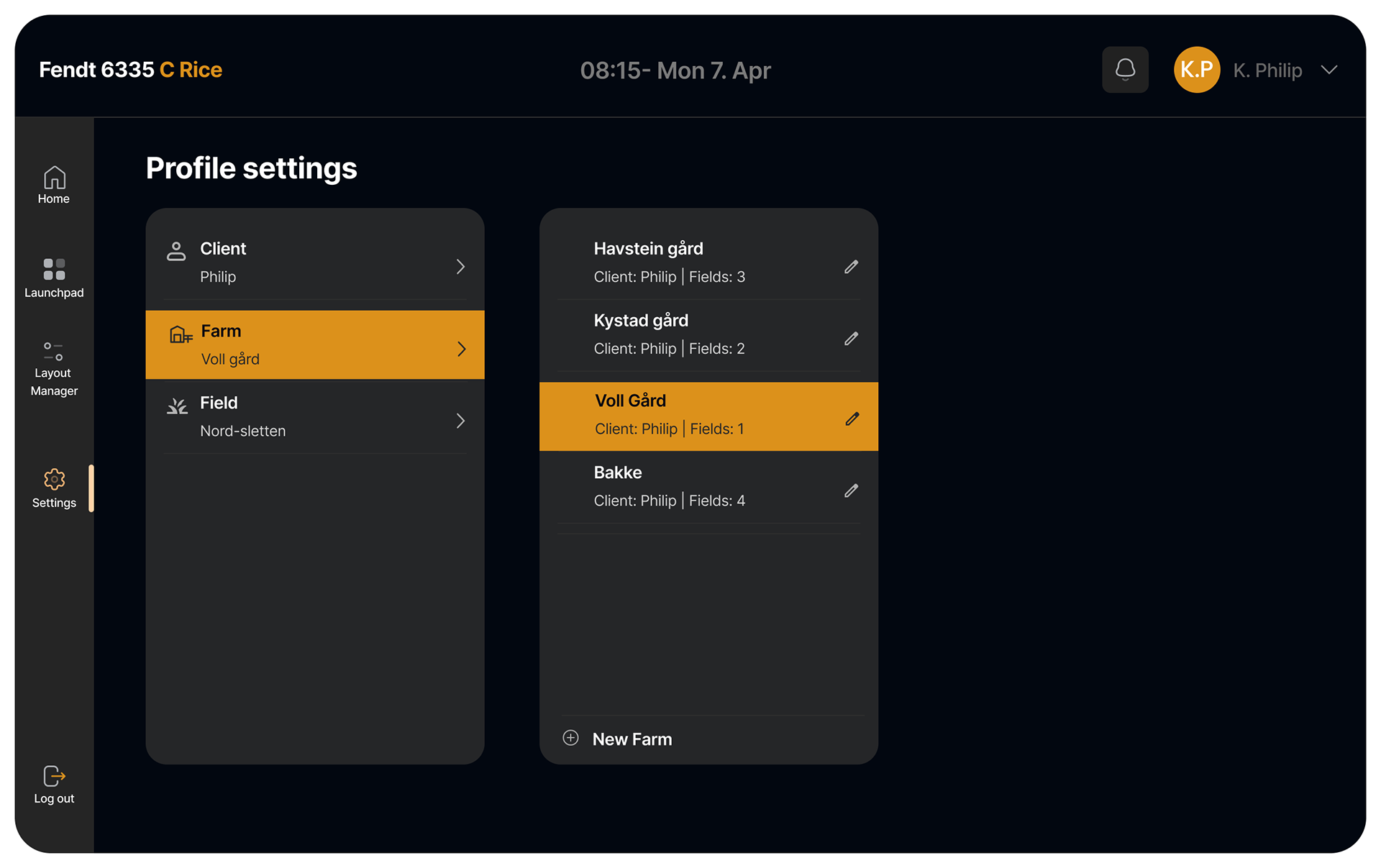
The result is a high-fidelity prototype of a modular, multi-screen HMI tailored to combine harvesters and their operators. Designed for flexibility and clarity, the interface allows users to customize layouts in the layout manager. Access all applications in a central Launchpad, distributing information across two or three screens to reduce clutter and support task focus. Key modules include real-time harvesting statistics, obstacle detection with radar visualization, voice-activated warnings, live weather-forecast data, machine settings, and optional media controls like Spotify. The system supports drag-and-drop functionality, large touch targets, and dynamic layouts that adapt to different operational needs. Visually, it adheres to CrossControl’s brand aesthetics while incorporating usability principles such as visual hierarchy, salience, and progressive disclosure. While the artefact remains conceptual and untested in full operational contexts, expert feedback suggests it significantly improves readability, reduces interaction friction, and aligns well with user workflows. It stands as a strong foundation for future development, including system integration and broader usability testing.
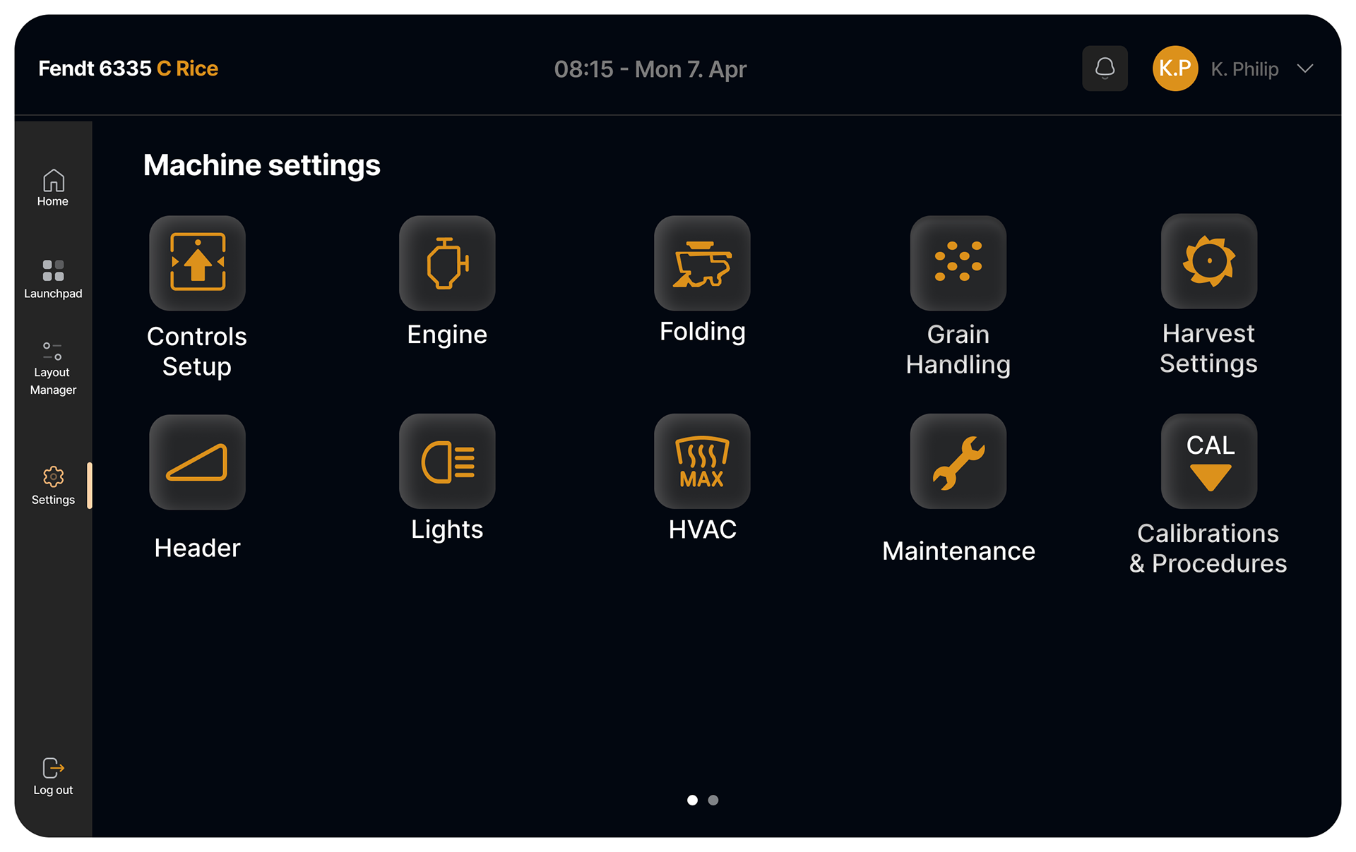
Machine settings
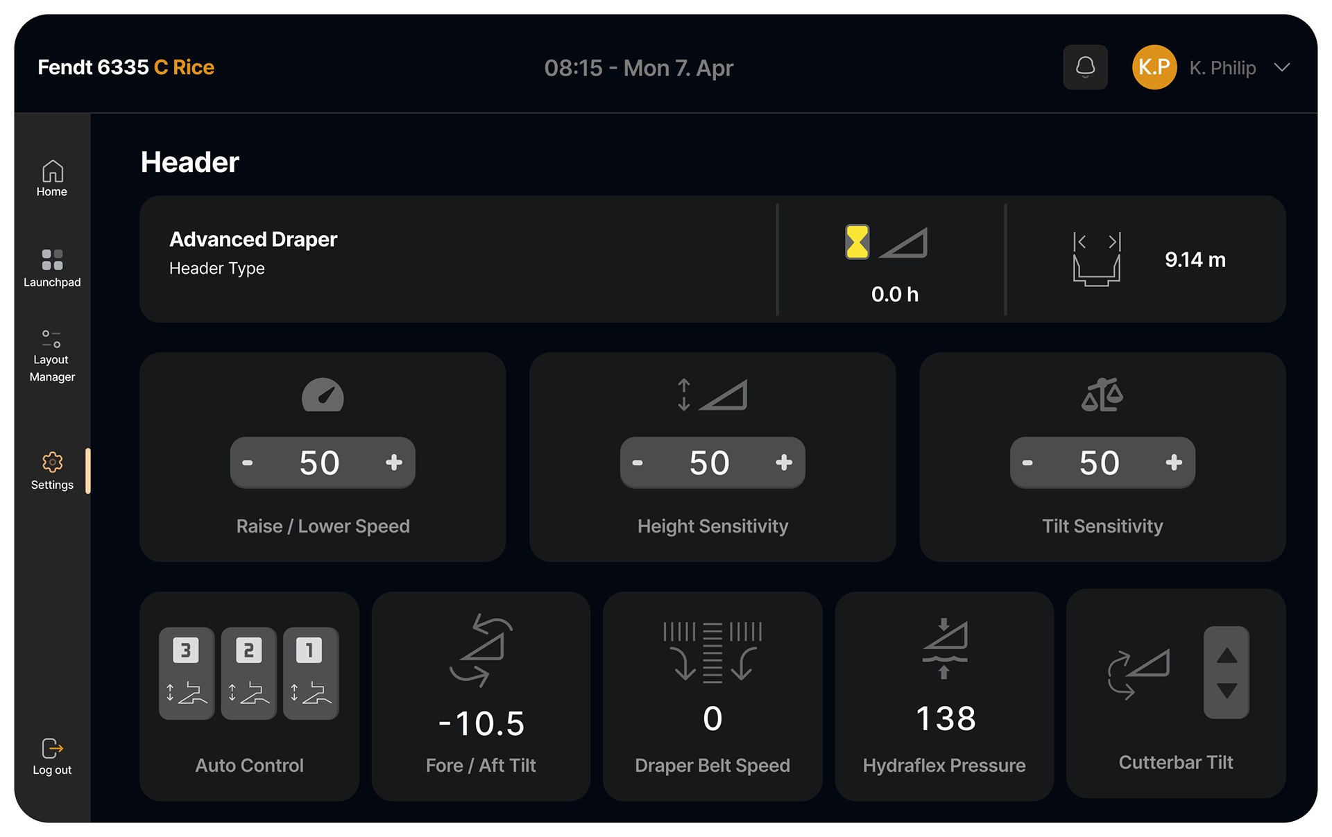
Header setting
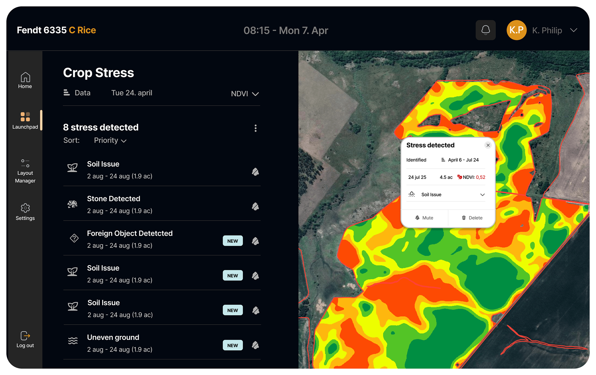
Map mode, including yield map and crop stress
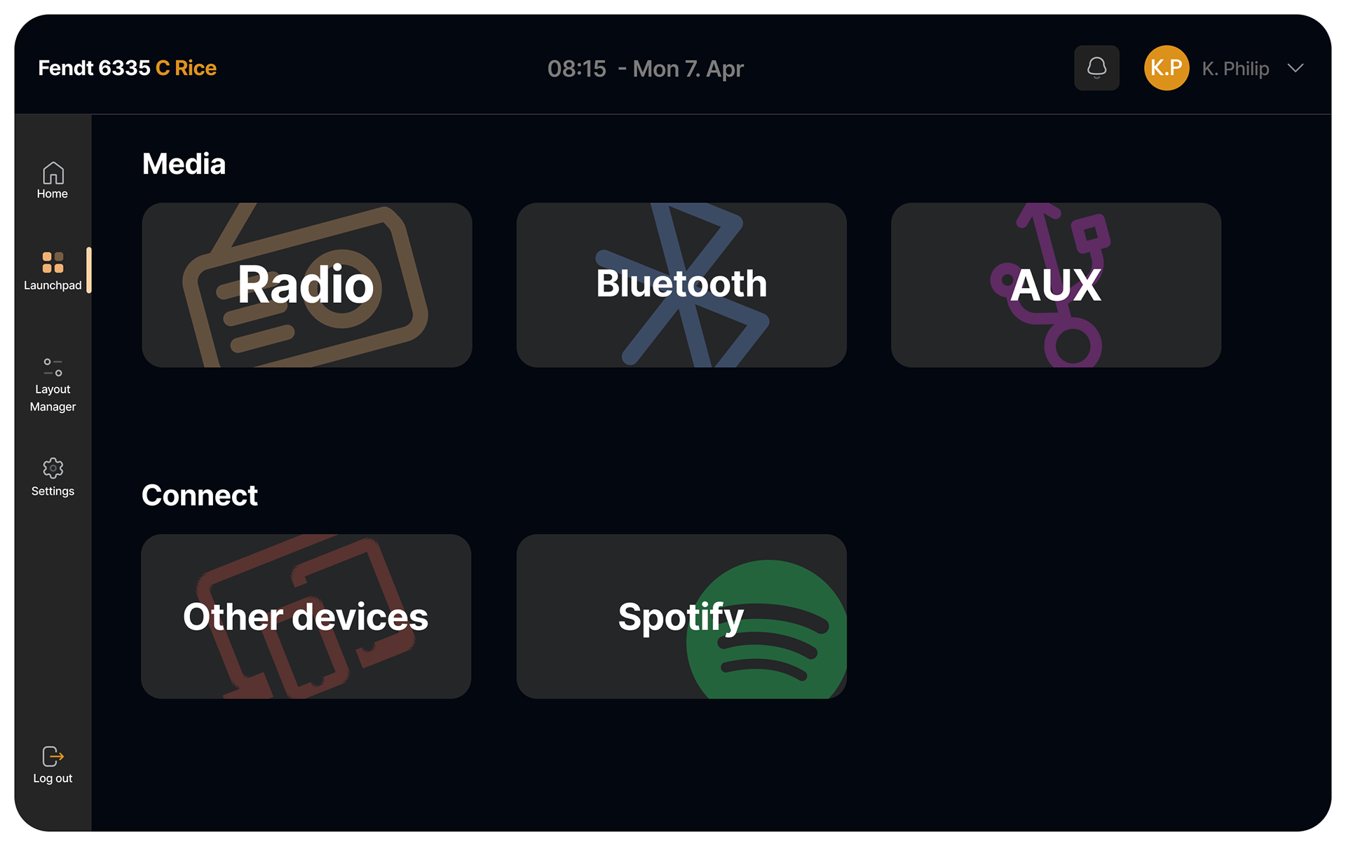
Media selector
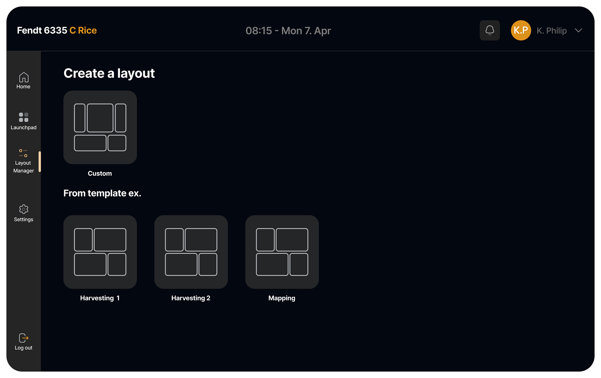
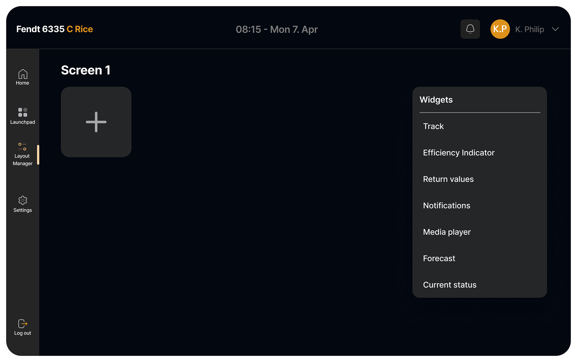
layout presets
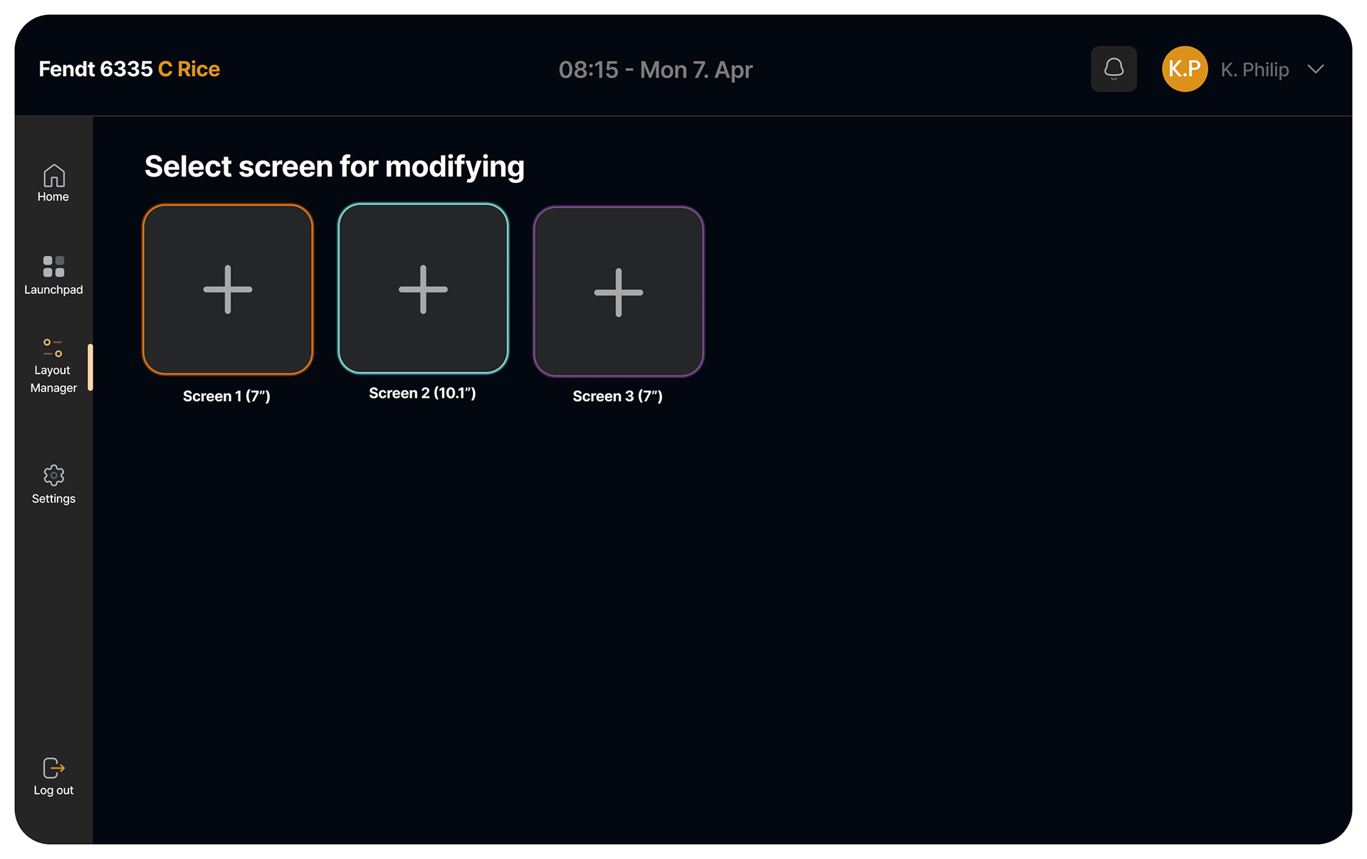
Choose a screen to modify